We’re proud to launch our latest website for Law Access.
Law Access falls under the Law Society of Western Australia therefore the UI had to be in keeping with the Society’s branding (colours and fonts). As the audience/clientele looking fo probono support from this client, they are diverse so the site is required to be highly accessible and WCAG compliant.
To ensure we were creating a website that would help the users achieve their objectives we worked closely with the client to define who the users were and what they needed out of the website alongside their business needs.
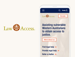
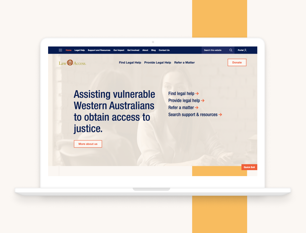
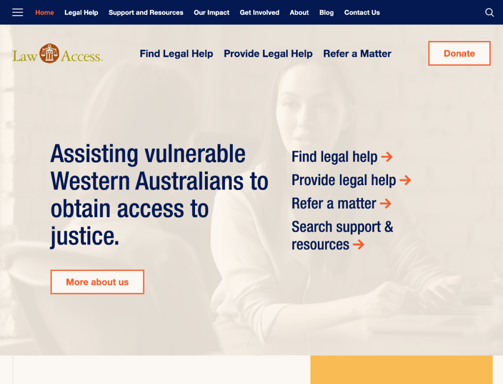
The primary users would be applicants or pro-bono lawyers ( those who either want to; apply for help, assist someone to apply for help or apply to help. These three actions are the primary goals of their users and have been featured as primary navigation elements in the header and homepage banner area for easy access.
It was also discovered that further support and resources were required to help facilitate the application process for both the general public and lawyers. Support and resources have been grouped into a single section where all FAQs, tips, documents and resources are accessed, sorted by user types or search. The reason behind grouping it all together is because there is a lot of interlinking information, therefore it is a better UX if it is all in one section.
Law access also required a portal for registered Law Access Lawyers to access resources and documentation. This needed to be easily accessed but discrete as only Law Access can assign lawyers access to it.
We created a two level navigation header to allow for key pages to be featured. The blue menu bar is sticky to allow for easy access to the menu at any point, with a full screen (burger) menu which displays the full menu in siloed format. We have also included a full site search in this menu bar for those that want to quickly search and find specific content.
Within the page layouts navigation and search (if needed) within the pages is consistently on the left hand side. Creating reliable and easy to use and learn page navigation language.
A sticky quick exit button is easily accessed at the bottom right for those that are nervous they may get caught out looking at this site.
Want to see what it looks like?
Check out our project summary.