Occasionally clients ask about keeping things ‘above the fold’, because they’ve seen or heard it mentioned as an important web design tactic. But actually, the fold doesn’t matter.
What is ‘the fold’, anyway?
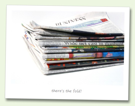
The fold is an imaginary line dividing what can be seen when a page loads with what the user needs to scroll down to see. The term originated from newspaper advertising. In newspapers there really is a physical fold.
Is the fold relevant in web design?
The answer to this question is both yes and no. It’s important that when a web site loads, the user can tell what the site is about within a few seconds. Often that is all the time you have to make an impression before the user clicks elsewhere. Having the most important information at the top of the page where it’s immediately visible in those critical initial seconds makes sense.
But the web is all about scrolling.
Way back last century, usability pundits like Jakob Nielsen tried to tell us that users don’t scroll. But that was then, and this is now. Users are smarter than we often give them credit for. They know that to get the information they want, they need to do get adventurous with the mouse and/or arrow keys. Scrolling is second nature to web users by now, and we don’t need to be afraid of it.
Just where is the fold?
The imaginary fold is not in a predefined position any more.
The vast array of devices used to view web sites – from desktop computers and laptops to TVs, games consoles, tablets, mobile phones and even refrigerators! – means that you can’t really know where the fold is.
So don’t spend all your time worrying about an imaginary line that may be almost anywhere. Put your most critical information at the top of the page. And encourage users to explore further with great hooks to get the meat of your content.
And remember – there is no page fold.
share this